
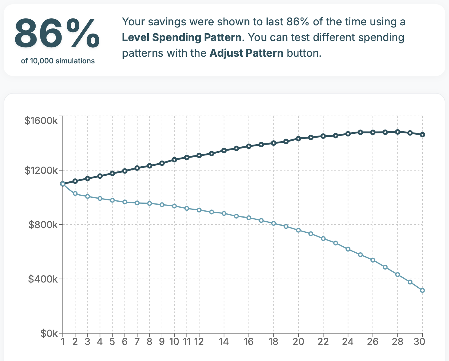
When you run your numbers in SafelySpend for the first time, you’ll be presented with a Results View that shows a dark blue and light blue line indicating how much of your savings are left at the start of each year over the course of your retirement.
Before we get into why those two lines differ and just what each line represents, it’s important to keep in mind that no personal finance tool, from your basic calculator to complex spreadsheets and expensive software used by professionals, can actually predict the future. And that includes SafelySpend.
Instead what we do is build a model of what is statistically possible based on all the information you provide, combined with common assumptions around market volatility. We run that model ten thousand times, randomizing the market volatility each time, and then show you two possible outcomes that are intened to help you make an informed decision.
So what are those two outcomes? What do those two lines, in dark and light blue, represent in SafelySpend?
The dark blue line represents the median outcome. It takes the results from all ten thousand simulations and shows you the results in the middle of all those good and bad possibilities.
This does not mean it is what is most likely to happen each year, but it is a useful result for comparing against the second result SafelySpend shows you.
The light blue line represents the 20th percentile result, which offers you a more conservative possibility to consider. From all the possible outcomes of how much savings you could have left each year, this result comes in right below 80% of them.
By showing you a median and conservative result, SafelySpend avoids the pitfall of encouraging best case scenario forecasting — a dangerous game to play when planning for money that needs to last you the rest of your life, long after you’ve stopped working.
You have to make your own choices about what feels right for you, but a common piece of advice is to build a withdrawal plan for your retirement savings that is forecasted to work out 80% of the time. The reasoning is that you aren’t being so conservative that you underspend and under enjoy your hard earned savings, while also giving you enough breathing room to update your plan should a far more conservative outcome prevail.
Along with the median and conservative outcome lines, SafelySpend shows you a percentage result to make it even easier to decide if your plan looks to be on track or still needs adjusting. A result of 80% or higher in SafelySpend indicates that in both the median and conservative outcomes your savings were shown to last for the duration of your retirement.
Another common piece of advice is to update your plan every few years, or any time your savings dip below your conservative estimate. When you download your withdrawal plan from SafelySpend, there is a column at the far right that shows you what the conservative savings threshold is for the start of each year to help you decide if it’s time to update your plan in SafelySpend or continue staying the course.
Now that you know what the results in SafelySpend represent, you can make a more informed decision about how to plan for your retirement. Remember, no retirement planning tool can actually predict the future with pinpoint accuracy, so be sure to review your plan often and update it when necessary.
Unlike a lot of other retirement planning tools out there, SafelySpend is not a subscription. You get unlimited usage for your one time payment of just $49, so you can update your plan as often as you like.
If you’ve yet to give SafelySpend a try, click here to get started and discover how much you can safely spend in your retirement.